Project Overview
Project Overview
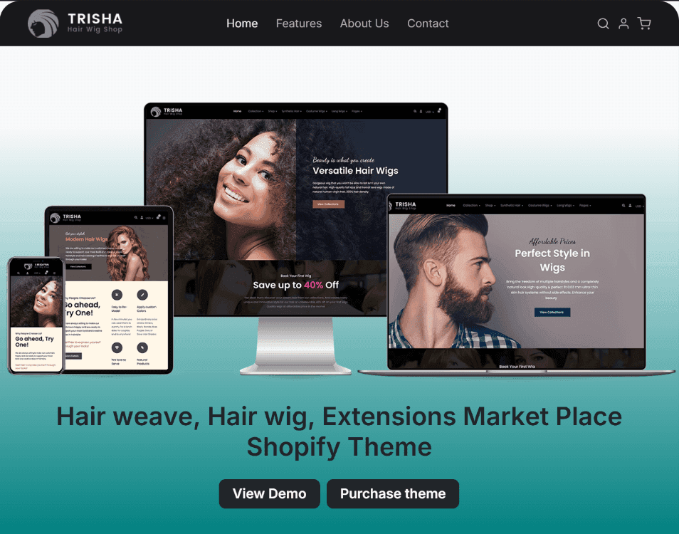
A modern e-commerce redesign for Trisha Hair & Wig Shop, delivering a sleek shopping experience with easy product discovery, seamless navigation, and a stylish brand appeal.
A modern e-commerce redesign for Trisha Hair & Wig Shop, delivering a sleek shopping experience with easy product discovery, seamless navigation, and a stylish brand appeal.
Goal: The goal of the Trisha redesign is to simplify the user experience by creating a concise and engaging landing page that clearly communicates the platform’s purpose and offerings in one place. By reducing navigation complexity, the redesign aims to help users quickly understand what Trisha is about, making it easier to explore products and encouraging higher engagement and conversions.
Goal: The goal of the Trisha redesign is to simplify the user experience by creating a concise and engaging landing page that clearly communicates the platform’s purpose and offerings in one place. By reducing navigation complexity, the redesign aims to help users quickly understand what Trisha is about, making it easier to explore products and encouraging higher engagement and conversions.
Role: Lead Designer (Solo Case Study).
Role: Lead Designer (Solo Case Study).
Timeline: 1 week.
Timeline: 1 week.
Problem Statement
Problem Statement
First-time shoppers on the original Trisha platform often found the navigation confusing and overwhelming, making it hard to quickly grasp what the website offers and how to find products they need. This complexity caused frustration, reduced trust, and led to users leaving before exploring the site fully. To better support new users, there was a need for a simplified, clear landing page that immediately communicates the platform’s value and guides first-time shoppers smoothly into their buying journey.
First-time shoppers on the original Trisha platform often found the navigation confusing and overwhelming, making it hard to quickly grasp what the website offers and how to find products they need. This complexity caused frustration, reduced trust, and led to users leaving before exploring the site fully. To better support new users, there was a need for a simplified, clear landing page that immediately communicates the platform’s value and guides first-time shoppers smoothly into their buying journey.
Solution
Solution
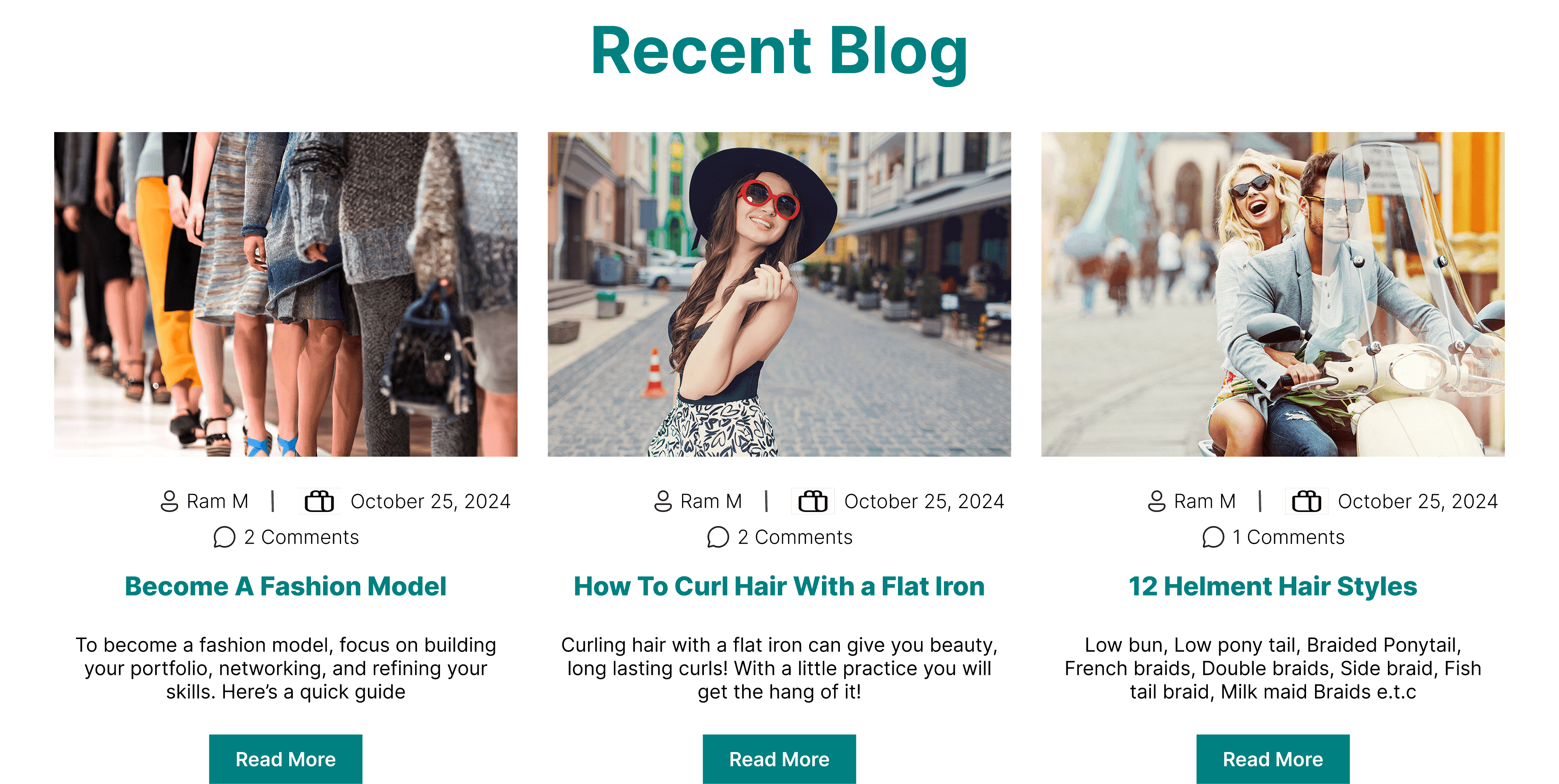
The redesign of Trisha features a clean, focused landing page that clearly communicates the platform’s purpose and key offerings in a single view. By simplifying navigation and emphasizing essential information, the new design helps first-time shoppers quickly understand what Trisha provides and encourages them to explore products with confidence. This streamlined approach reduces confusion, builds trust, and improves user engagement and conversion rates.
The redesign of Trisha features a clean, focused landing page that clearly communicates the platform’s purpose and key offerings in a single view. By simplifying navigation and emphasizing essential information, the new design helps first-time shoppers quickly understand what Trisha provides and encourages them to explore products with confidence. This streamlined approach reduces confusion, builds trust, and improves user engagement and conversion rates.
Project Process
Project Process
I started by analyzing the existing platform to identify pain points, especially around navigation and first-time user confusion. After defining the core goal to simplify and clarify the user experience, I researched best practices for e-commerce landing pages and competitor designs. I then mapped out a streamlined content structure and created wireframes focusing on clear messaging and intuitive layout. For the visual design, I chose a clean, modern style with engaging visuals and clear calls to action to guide users. The design was made fully responsive to work seamlessly on all devices, ensuring a consistent and user-friendly experience.
I started by analyzing the existing platform to identify pain points, especially around navigation and first-time user confusion. After defining the core goal to simplify and clarify the user experience, I researched best practices for e-commerce landing pages and competitor designs. I then mapped out a streamlined content structure and created wireframes focusing on clear messaging and intuitive layout. For the visual design, I chose a clean, modern style with engaging visuals and clear calls to action to guide users. The design was made fully responsive to work seamlessly on all devices, ensuring a consistent and user-friendly experience.
Typography: For the Trisha redesign, I chose Inter, a modern and highly readable typeface designed specifically for digital interfaces. Inter’s clean lines and excellent legibility make it ideal for both headings and body text, ensuring users can easily read content across all devices. Its versatile font weights helped establish a clear visual hierarchy, guiding users smoothly through the landing page and enhancing overall usability.
Typography: For the Trisha redesign, I chose Inter, a modern and highly readable typeface designed specifically for digital interfaces. Inter’s clean lines and excellent legibility make it ideal for both headings and body text, ensuring users can easily read content across all devices. Its versatile font weights helped establish a clear visual hierarchy, guiding users smoothly through the landing page and enhancing overall usability.
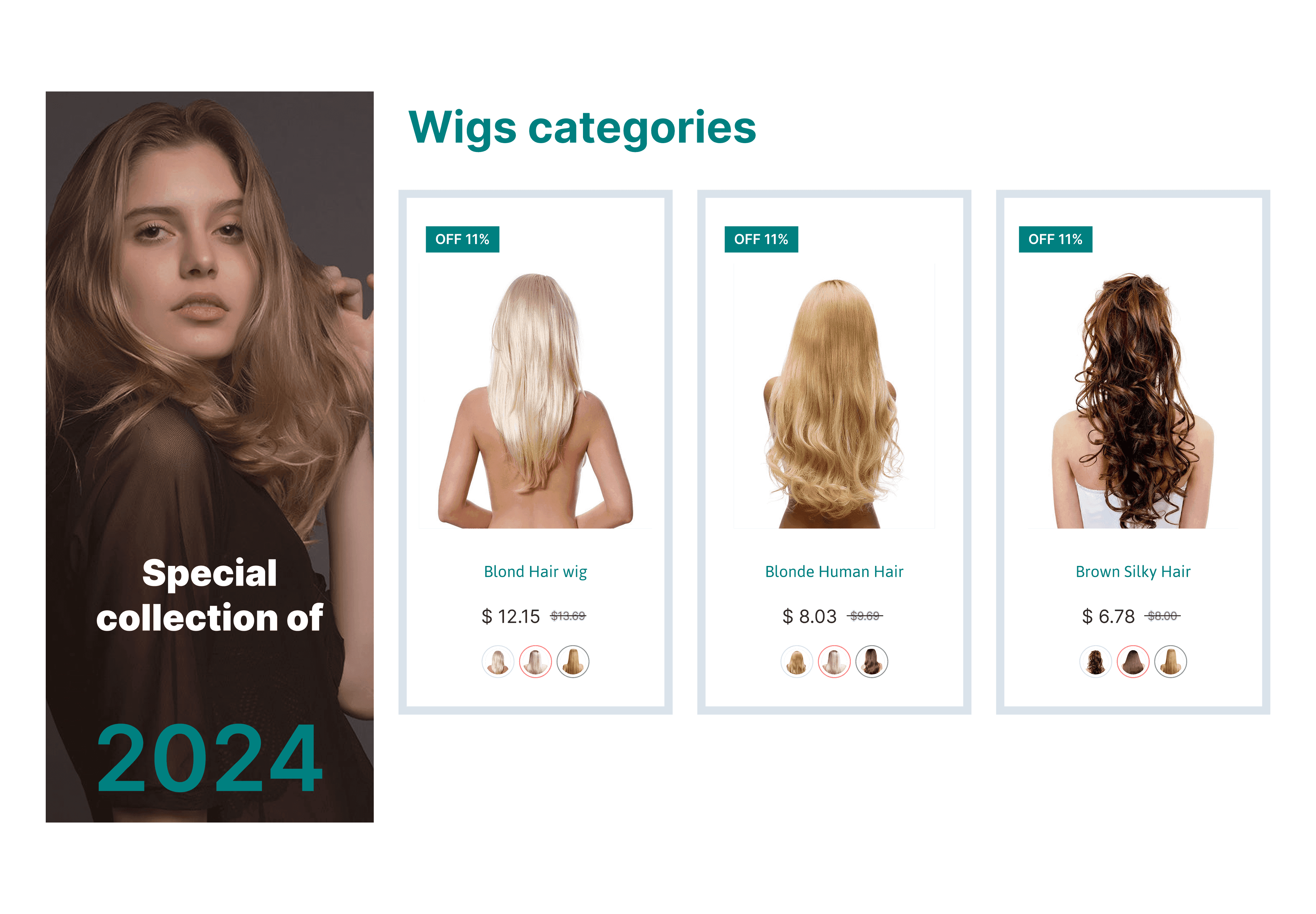
Colour: I maintained the original primary color, #008080, for the redesign because it conveys a cool, calming, and welcoming vibe. This teal shade helps create a friendly and trustworthy atmosphere, aligning perfectly with Trisha’s brand identity. Using a consistent primary color also supports brand recognition and visual cohesion throughout the landing page.
Colour: I maintained the original primary color, #008080, for the redesign because it conveys a cool, calming, and welcoming vibe. This teal shade helps create a friendly and trustworthy atmosphere, aligning perfectly with Trisha’s brand identity. Using a consistent primary color also supports brand recognition and visual cohesion throughout the landing page.
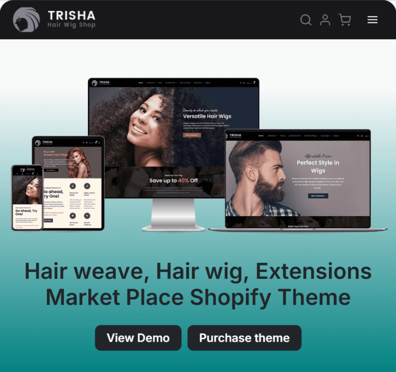
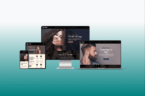
Adaptability: The redesign of Trisha is fully responsive, ensuring the landing page delivers a seamless and consistent experience across all devices, from desktops to smartphones. Layouts, typography, and visuals adjust smoothly to different screen sizes without losing clarity or impact, making the platform accessible and user-friendly for everyone.
Adaptability: The redesign of Trisha is fully responsive, ensuring the landing page delivers a seamless and consistent experience across all devices, from desktops to smartphones. Layouts, typography, and visuals adjust smoothly to different screen sizes without losing clarity or impact, making the platform accessible and user-friendly for everyone.

Studio
Ready to elevate your brand and transform your digital presence? Let’s connect and create something remarkable together.
Studio
Ready to elevate your brand and transform your digital presence? Let’s connect and create something remarkable together.
Studio
Ready to elevate your brand and transform your digital presence? Let’s connect and create something remarkable together.